创建自定义主题
用 Studio 创建主题
主题定义在 SCSS 文件中。如需在项目中创建自定义主题,需要在 src/main/themes/<theme-name> 文件夹创建特定的文件结构。
使用 Jmix Studio 可以很方便做到这点:右键点击 Jmix 项目窗口中的 User Interface 节点,然后选择 New → Custom Theme。输入主题的唯一名称,然后在 Base theme 下拉列表中选择想要扩展的主题。
结果会创建下列目录结构(例如,扩展 Helium 主题):
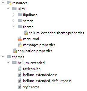
资源文件夹下必须有 <theme-name>-theme.properties 文件。
styles.scss 是主题编译的入口点:
@import "helium-extended-defaults";
@import "addons";
@import "helium-extended";

.helium-extended {
  @include addons; (1)
  @include helium-extended;
}| 1 | addons 是个特殊文件,基于添加的 主题扩展组件 自动生成。 |
编译后的主题位于 build/themes 文件夹内,会一并打包至项目的 JAR/WAR 中。
application.properties 文件中定义了主题名称和对应的 <theme-name>-theme.properties 文件路径:
jmix.ui.theme.name = helium-extended
jmix.ui.theme-config = ui/ex1/theme/helium-extended-theme.properties|
可以无需重启应用程序重新编译主题:
然后需要强制浏览器重新加载网页。 例如,对于 Google Chrome,可以按下 |
自定义 Helium 主题
自定义默认 Helium 主题最简单的方法是使用 在线 交互式编辑器。这里可以创建自定义的颜色配置,然后在项目中使用,按照下列步骤:
-
用 Jmix Studio 扩展项目的 Helium 主题:右键点击 Jmix 项目窗口中的 User Interface 节点,然后选择 New → Custom Theme。输入主题的新名称,例如,
helium-extended,然后在 Base theme 下拉列表中选择 helium 主题。 -
打开线上的 主题编辑器。这里可以设置样式变量并马上看到调整结果。
-
一旦样式设定满足要求,点击 Download 按钮。
-
复制变量定义,放置于
helium-extended.scss文件内,示例:@import "../helium/helium"; @mixin helium-extended { @include helium; /* Basic */ --primary-color: #0097D8; --primary-color_rgb: 0, 151, 216; /* Common */ --primary-color-shade-1: #0084BD; --primary-color-shade-2: #0076A8; --primary-dim-color: #2EC0FF; /* TextField */ --textfield-background-color: #E8FFFC; } -
重启应用程序。用户第一次登录后即可查看使用 Helium-extended 主题的应用。
Helium 主题预设样式
预设样式(Preset)是颜色的 CSS 变量列表。使用预设样式,你可以将颜色(例如,公司的颜色)集成到应用程序中。
可以创建自定义的预设样式或者使用内置的预设样式。
Helium 主题及其扩展主题带有两套内置的颜色预设样式:dark 和 white。
所有可用的颜色预设样式在 application.properties 文件定义:
jmix.ui.theme.modes = light, dark默认颜色预设样式为 light。
Helium 主题及其扩展主题带有三套内置的尺寸预设样式:small、medium 和 large。
所有可用的主题尺寸预设样式在 application.properties 文件定义:
jmix.ui.theme.sizes = small, medium, large默认尺寸预设样式为 medium。
下面我们创建一个新的颜色预设样式 - cobalt。
-
用 Jmix Studio 扩展项目的 Helium 主题:右键点击 Jmix 项目窗口中的 User Interface 节点,然后选择 New → Custom Theme。输入主题的新名称,例如,
helium-ext,然后在 Base theme 下拉列表中选择 helium 主题。 -
定义变量,并放置于
helium-ext.scss文件内,示例:@import "../helium/helium"; @mixin helium-ext { @include helium; &.cobalt { @include helium-cobalt; } } @mixin helium-cobalt { /* Basic */ --primary-color: #0055A6; --primary-color_rgb: 0, 85, 166; /* Common */ --primary-color-shade-1: #004C95; --primary-color-shade-2: #004484; --primary-dim-color: #C6D1EC; /* Button */ --button-primary-focused-border-color: #C6D1EC; } -
在
application.properties文件中定义新的颜色预设样式,并设为默认:jmix.ui.theme.modes = light, dark, cobalt jmix.ui.theme.default-mode-to-use = cobalt -
重启应用程序。用户第一次登录后即可查看使用 cobalt 预设样式 Helium-ext 主题的应用。
更改品牌
可以配置品牌相关的属性,例如,图标、登录界面、主程序窗口标题、网站图标(favicon.ico)。
如需使用自定义图片,可以替换 src/main/themes/<theme-name>/branding 目录中的默认图片。
要设置窗口标题和登录窗口欢迎文本,请在 messages.properties 中设置。更新消息值内容反映应用程序的不同用途。示例:
ui.ex1/menu.application=Main Menu

ui.ex1.screen.main/application.caption = Sample UI Application
ui.ex1.screen.main/application.logoLabel = Sample UI Application
ui.ex1.screen.login/welcomeLabel = Welcome to Sample UI Application
添加字体
可以为主题添加自定义字体。添加一个 Font Family,在 styles.scss 文件的第一行导入,示例:
@import url(http://fonts.googleapis.com/css?family=Roboto);如需替换项目中的标准字体,可在 <theme-name>-defaults.scss 文件中设置自定义字体:
$v-font-family: 'Roboto';创建新样式
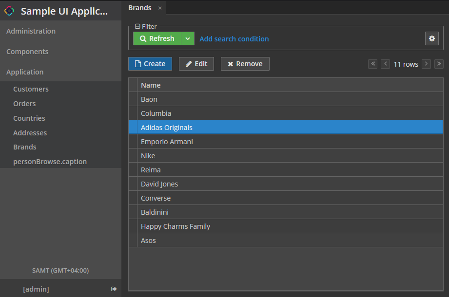
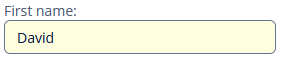
考虑为显示客户名称的文本组件设置黄色背景颜色的示例。
在 XML 描述中,定义了 TextField 组件:
<textField id="nameTextField"
           dataContainer="customerDc"
           property="firstName"
           caption="First name:"
           stylename="name-field"/>
在 stylename 属性中,设置样式的名称。
在 <theme-name>.scss 文件中的 <theme-name> mixin 内添加新的样式定义:
@import "../helium/helium";

@mixin helium-extended {
  @include helium;

  .name-field {
      background-color: lightyellow;
  }
}
重建项目后,组件将如下所示:
修改现有样式
要修改现有组件的样式参数,请将相应的 CSS 代码添加到 <theme-name>.scss 文件的 <theme-name> mixin 中。使用 Web 浏览器的开发者工具查找分配给可视化组件元素的 CSS 类。例如,要以粗体显示应用程序菜单项,<theme-name>.scss 文件的内容应如下所示:
@import "../helium/helium";

@mixin helium-extended {
  @include helium;

  .jmix-sidemenu-item-caption {
      font-weight: bold;
  }
}
修改通用参数
主题包含许多控制应用程序背景颜色、组件大小、边距和其他参数的 SCSS 变量。
以下是 Halo 主题扩展的示例,因为它基于来自 Vaadin 的 Valo 主题,并提供最多的自定义选择。
<theme-name>-defaults.scss 文件用于覆盖主题变量。大多数 Halo 变量对应于 Valo 文档 中描述的变量。以下是最常见的变量:
$v-background-color: #fafafa;        /* component background color */
$v-app-background-color: #e7ebf2;    /* application background color */
$v-panel-background-color: #fff;     /* panel background color */
$v-focus-color: #3b5998;             /* focused element color */
$v-error-indicator-color: #ed473b;   /* empty required fields color */

$v-line-height: 1.35;                /* line height */
$v-font-size: 14px;                  /* font size */
$v-font-weight: 400;                 /* font weight */
$v-unit-size: 30px;                  /* base theme size, defines the height for buttons, fields and other elements */

$v-font-size--h1: 24px;              /* h1-style Label size */
$v-font-size--h2: 20px;              /* h2-style Label size */
$v-font-size--h3: 16px;              /* h3-style Label size */

/* margins for containers */
$v-layout-margin-top: 10px;
$v-layout-margin-left: 10px;
$v-layout-margin-right: 10px;
$v-layout-margin-bottom: 10px;

/* spacing between components in a container (if enabled) */
$v-layout-spacing-vertical: 10px;
$v-layout-spacing-horizontal: 10px;

/* whether filter search button should have "friendly" style*/
$jmix-filter-friendly-search-button: true;

/* whether button that has primary action or marked as primary itself should be highlighted*/
$jmix-highlight-primary-action: false;

/* basic table and datagrid settings */
$v-table-row-height: 30px;
$v-table-header-font-size: 13px;
$v-table-cell-padding-horizontal: 7px;
$v-grid-row-height
$v-grid-row-selected-background-color
$v-grid-cell-padding-horizontal

/* input field focus style */
$v-focus-style: inset 0px 0px 5px 1px rgba($v-focus-color, 0.5);
/* required fields focus style */
$v-error-focus-style: inset 0px 0px 5px 1px rgba($v-error-indicator-color, 0.5);

/* animation for elements is enabled by default */
$v-animations-enabled: true;
/* popup window animation is disabled by default */
$v-window-animations-enabled: false;

/* inverse header is controlled by cuba.web.useInverseHeader property */
$v-support-inverse-menu: true;

/* show "required" indicators for components */
$v-show-required-indicators: false !default;
下面提供了具有深色背景和略微减少边距主题的示例 <theme-name>-defaults.scss:
@import "../halo/halo-defaults";

$v-background-color: #444D50;

$v-font-size--h1: 22px;
$v-font-size--h2: 18px;
$v-font-size--h3: 16px;

$v-layout-margin-top: 8px;
$v-layout-margin-left: 8px;
$v-layout-margin-right: 8px;
$v-layout-margin-bottom: 8px;

$v-layout-spacing-vertical: 8px;
$v-layout-spacing-horizontal: 8px;

$v-table-row-height: 25px;
$v-table-header-font-size: 13px;
$v-table-cell-padding-horizontal: 5px;

$v-support-inverse-menu: false;

$jmix-highlight-primary-action: true;
修改服务端主题参数
可以重定义 <theme-name>-theme.properties 文件中的变量,这些变量指定了一些服务端的参数。例如,需要调整 Filter 组件中 Add Condition(添加条件) 对话框的大小,<theme-name>-theme.properties 文件可以包含下列内容:
@include=io/jmix/ui/theme/halo-theme.properties

jmix.ui.filter.addConditionScreen.dialog.height = 500
jmix.ui.filter.addConditionScreen.dialog.width = 500
手动创建主题
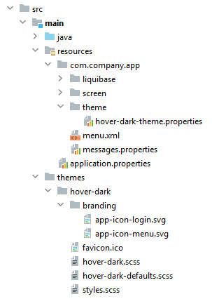
我们创建一个 Hover Dark 主题,是内置 Hover 主题的暗色变体。
-
在项目中创建如下文件结构:
-
hover-dark.scss文件:@import "../hover/hover"; @mixin hover-dark { @include hover; } -
hover-dark-defaults.scss文件:@import "../hover/hover-defaults";在
hover-dark-defaults.scss文件中重写默认的样式变量;即,用下列变量替换原来的:@import "../hover/hover-defaults"; $v-app-background-color: #262626; $v-background-color: lighten($v-app-background-color, 12%); $v-border: 1px solid (v-tint 0.8); $font-color: valo-font-color($v-background-color, 0.85); $v-button-font-color: $font-color; $v-font-color: $font-color; $v-link-font-color: lighten($v-focus-color, 15%); $v-link-text-decoration: none; $v-textfield-background-color: $v-background-color; $jmix-hover-color: #75a4c1; $jmix-maintabsheet-tabcontainer-background-color: $v-app-background-color; $jmix-menubar-background-color: lighten($v-app-background-color, 4%); $jmix-tabsheet-tab-caption-selected-color: $v-font-color; $jmix-window-modal-header-background: $v-background-color; $jmix-menubar-menuitem-border-radius: 0; -
styles.scss文件:@import "hover-dark-defaults"; @import "addons"; @import "hover-dark"; .hover-dark { @include addons; @include hover-dark; } -
在
src/main/resources/<project package>/theme目录创建hover-dark-theme.properties文件:@include=io/jmix/ui/theme/hover-theme.properties -
在
build.gradle中定义下面的依赖以构建扩展主题:dependencies { // ... themes 'io.jmix.ui:jmix-ui-themes' implementation 'io.jmix.ui:jmix-ui-themes' } -
在
application.properties文件中定义主题名称和相应的<theme-name>-theme.properties文件路径:jmix.ui.theme.name = hover-dark jmix.ui.theme-config = ui/ex1/theme/hover-dark-theme.properties -
重启应用程序或 重编译主题。用户第一次登录后即可查看使用 Hover-dark 主题的应用。