PopupButton 弹窗按钮
XML 元素
actions
该元素指定下拉列表内的操作。
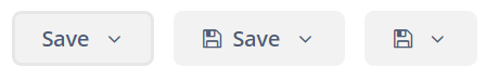
操作的属性中只有 caption、enable、visible 能起作用。description 和 shortcut 属性会被忽略。icon 属性的处理取方式决于组件的 showActionIcons 属性。默认 showActionIcons=false。
下面是一个 PopupButton 示例,其中包含一个具有两个操作的下拉列表:
<popupButton id="popupButton1"
             caption="Save"
             showActionIcons="true">
    <actions>
        <action id="popupAction1"
                caption="Save as .doc"
                icon="FILE_WORD_O"/>
        <action id="popupAction2"
                caption="Save as .pdf"
                icon="FILE_PDF_O"/>
    </actions>
</popupButton>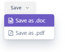
|
如需在 Jmix Studio 中添加操作,可以在界面 XML 或者 Component Hierarchy 面板中选择 |
可以定义新的操作,也可以使用当前界面中任意元素已定义的操作。下面例子中,personsPopupButton 组件使用了 personsTable 中定义的操作:
<groupTable id="personsTable"
            width="100%"
            dataContainer="personsDc">
    <columns>
        <column id="name"/>
        <column id="image"/>
    </columns>
    <actions>
        <action id="create" type="create"/>
        <action id="edit" type="edit"/>
        <action id="remove" type="remove"/>
    </actions>
</groupTable>

<popupButton id="personsPopupButton"
             caption="Person">
    <actions>
        <action id="personsTable.create"/>
        <action id="personsTable.edit"/>
        <action id="personsTable.remove"/>
    </actions>
</popupButton>
popup
该元素为 PopupButton 弹窗设置自定义的内容。如果设置了自定义弹出内容,则会忽略操作。
下面是自定义弹出布局的示例:
<popupButton id="customPopupButton"
             caption="Settings"
             icon="GEARS"
             popupOpenDirection="BOTTOM_CENTER">
    <popup>
        <vbox margin="true"
              spacing="true"
              width="260px">
            <label align="MIDDLE_CENTER"
                   stylename="h2"
                   value="Settings"/>
            <progressBar caption="Progress"
                         width="100%"/>
            <textField id="textField"
                       caption="Comment"
                       width="100%"/>
            <comboBox id="comboBox"
                      caption="Status"
                      optionsEnum="ui.ex1.entity.Status"
                      width="100%"/>
            <hbox spacing="true">
                <button id="saveAndCloseButton"
                        caption="Save"
                        icon="SAVE"/>
                <button id="cancelAndCloseButton"
                        caption="Cancel"
                        icon="REMOVE"/>
            </hbox>
        </vbox>
    </popup>
</popupButton>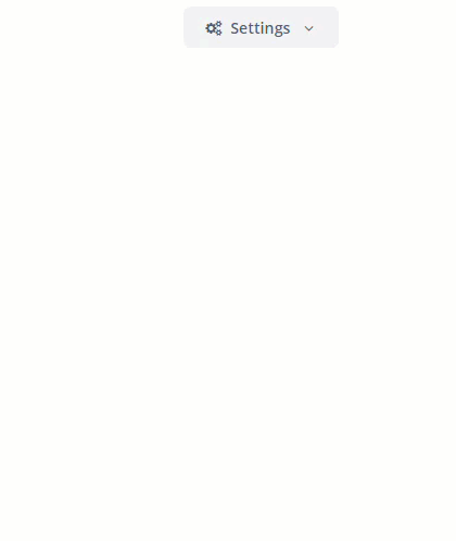
属性
-
autoClose- 定义是否应在操作触发后自动关闭弹窗。
-
closePopupOnOutsideClick- 如果设置为true,则单击弹窗外部时将其关闭。这不会影响单击按钮本身的行为。
-
showActionIcons- 显示操作按钮的图标。
-
togglePopupVisibilityOnClick- 定义在弹窗上连续点击是否切换弹窗可见性。
-
popupOpenDirection- 设置弹窗的打开方向。可能值:-
BOTTOM_LEFT -
BOTTOM_RIGHT -
BOTTOM_CENTER
-
跟踪弹窗可见性
也可以通过订阅相应事件来跟踪 PopupButton 的可见性状态变更:
@Autowired
protected Notifications notifications;

@Subscribe("popupButton")
public void onPopupButtonPopupVisibility(PopupButton.PopupVisibilityEvent event) {
    notifications.create()
            .withCaption("Popup visibility changed")
            .show();
}
另外,也可以使用组件的 API 添加事件监听器,示例:
@Autowired
protected PopupButton popupButton;
@Autowired
protected Notifications notifications;

@Subscribe
protected void onInit(InitEvent event) {
    popupButton.addPopupVisibilityListener(popupVisibilityEvent ->
            notifications.create()
                    .withCaption("Popup visibility changed")
                    .show());
}
样式
PopupButton 的外观可以使用带 $jmix-popupbutton-* 前缀的 SCSS 变量进行自定义。在创建了 自定义主题 之后,可以在可视化编辑器中修改这些变量。
XML 属性
align - autoClose - box.expandRatio - caption - captionAsHtml - closePopupOnOutsideClick - colspan - css - description - descriptionAsHtml - enable - height - htmlSanitizerEnabled - icon - id - menuWidth - popupOpenDirection - responsive - rowspan - showActionIcons - stylename - tabIndex - togglePopupVisibilityOnClick - visible - width
