GroupBoxLayout 分组框
基本用法
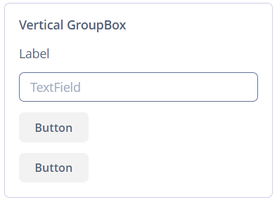
示例:
<groupBox caption="Vertical GroupBox"
          spacing="true"
          width="AUTO">
    <label value="Label"/>
    <textField inputPrompt="TextField"/>
    <button caption="Button"/>
    <button caption="Button"/>
</groupBox>默认情况下,groupBox 容器的宽度是 100%,与 vbox 类似。
属性
-
caption- 定义组标题。
-
orientation- 定义组件放置的方向 - 水平或垂直。默认值为vertical(垂直)。水平摆放如下所示: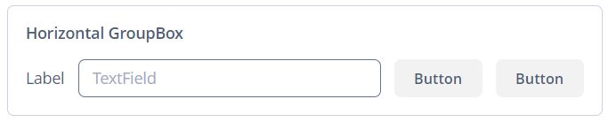
-
collapsable- 如果该值设置为true,可以使用左上角的按钮将组件的内容隐藏。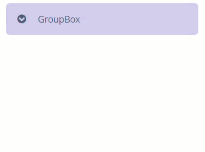
-
collapsed- 如果设置为true,初始状态下组件内容会被折叠。collapsed属性在collapsable="true"有效。
-
showAsPanel- 如果设置为true,该组件看起来就会像 Vaadin Panel。默认值为false。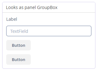
-
outerMargin- 设置groupBox边框的外边距。如果设置为true,组件的所有边都会添加外边距。要单独设置每一边的外边距,请为groupBox的每一边设置true或false:<groupBox outerMargin="true, false, true, false"/>
XML 属性
align - box.expandRatio - caption - captionAsHtml - collapsable - collapsed - colspan - contextHelpText - contextHelpTextHtmlEnabled - css - description - descriptionAsHtml - enable - expand - height - htmlSanitizerEnabled - icon - id - orientation - outerMargin requiredIndicatorVisible - responsive - rowspan - showAsPanel - spacing - visible - width
本页是否有帮助?

感谢您的反馈