button 按钮
基本用法
按钮上可以有标题、图标或者两者皆有:
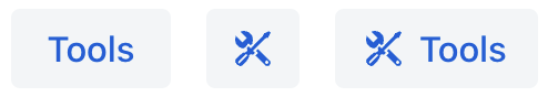
下面是定义带有标题、图标以及从 消息包 中获取文本显示到按钮提示的示例:
<button id="toolsButton"
        text="Tools"
        title="msg://toolsButton.title"
        icon="TOOLS"/>
在视图类中订阅 ClickEvent 事件可以处理按钮点击:
@Subscribe(id = "toolsButton", subject = "clickListener")
public void onToolsButtonClick(final ClickEvent<JmixButton> event) {
    // ...
}
操作
除了创建 ClickEvent 事件的处理方法外,按钮也可以与一个已有的 操作 进行关联。使用已有操作会更有效,这种方式会自动更新按钮的各种属性和行为。包括按钮的状态、可见性、文本、标题、图标以及用户交互输出。
如果操作是视图中定义的,可以通过按钮的 action 属性设置操作:
<actions>
    <action id="helloAction" text="Say Hello"/>
</actions>
<layout>
    <button id="helloButton" action="helloAction"/>
</layout>
如果操作是某个组件定义的,例如 dataGrid,则需在按钮的 action 属性中同时指定组件 id 和操作 id,以 "." 分隔:
<layout>
    <button id="createButton" action="usersTable.create"/>

    <dataGrid id="usersTable" dataContainer="users">
        <actions>
            <action id="create" type="list_create"/>
        </actions>
    </dataGrid>
</layout>
样式版本
使用 themeNames 属性设置组件的样式版本。
| 样式 | 描述 | 支持的主题 |
|---|---|---|
|
主要按钮样式 |
Aura, Lumo |
|
成功样式 |
Aura, Lumo |
|
警告样式 |
Aura, Lumo |
|
错误样式 |
Aura, Lumo |
|
对比样式 |
Lumo |
|
按钮较大 |
Aura, Lumo |
|
按钮较小 |
Aura, Lumo |
|
减少图标周围的空白 |
Aura, Lumo |
|
低优先级的按钮样式 |
Aura, Lumo |
|
适用于文本内容内部使用的内联按钮样式 |
Lumo |
XML 属性
id - action - alignSelf - ariaLabel - ariaLabelledBy - ariaLabelledBy - autofocus - classNames - css - disableOnClick - enabled - focusShortcut - height - icon - iconAfterText - maxHeight - maxWidth - minHeight - minWidth - tabIndex - text - themeNames - title - visible - whiteSpace - width
disableOnClick
如果 disableOnClick 属性设置成 true,这个按钮在点击之后就自动禁用,主要用来防止(意外的)多次点击。之后可以通过调用 setEnabled(true) 把按钮恢复成可点击状态。
icon
支持设置按钮的 Icon 组件。默认提供 2 组图标集:
-
Lumo 图标。可以在 XML 中设置:
<button id="lumoBtn" icon="lumo:photo"/>或者在控制器类中:
@ViewComponent protected JmixButton lumoBtn; @Subscribe public void onInit(InitEvent event) { Icon lumoIcon = new Icon("lumo", "photo"); lumoBtn.setIcon(lumoIcon); } -
Vaadin 图标。这些图标定义了常量。可以在 XML 中设置:
<button id="vaadinBtn" icon="ALARM"/>或者在控制器类中:
@ViewComponent
protected JmixButton vaadinBtn;

@Subscribe
public void onInit(InitEvent event) {
    Icon vaadinIcon = new Icon(VaadinIcon.PHONE);
    vaadinBtn.setIcon(vaadinIcon);
}
由于按钮可以有 前缀和后缀 组件,因此可以使用外部图片替代图标。
-
image 图片 组件作为图标:
<button id="imageIconBtn" text="Image">
    <prefix>
        <image resource="icons/icon.png"
               width="var(--lumo-icon-size-m)"/> (1)

    </prefix>
</button>
1 设置宽与 VaadinIcon相同。
-
svgIcon组件作为图标:<button id="svgIconBtn" text="Svg Icon"> <prefix> <svgIcon resource="icons/jmix-icon.svg"/> </prefix> </button>
事件和处理器
AttachEvent - BlurEvent - clickListener - doubleClickListener - singleClickListener - DetachEvent - FocusEvent
|
在 Jmix Studio 生成处理器桩代码时,可以使用 Jmix UI 组件面板的 Handlers 标签页或者视图类顶部面板的 Generate Handler 添加,也可以通过 Code → Generate 菜单(Alt+Insert / Cmd+N)生成。 |
clickListener
当用户点击组件时触发标题为 click 的 com.vaadin.flow.component.ClickEvent。
示例:
@Subscribe(id = "clickBtn", subject = "clickListener") (1)
public void onClickBtnClick(final ClickEvent<JmixButton> event) {
    JmixButton button = event.getSource(); (2)
}| 1 | @Subscribe 注解将处理方法与组件通过组件 id 进行关联。 |
| 2 | 如果需要,可以从 event 对象中获取点击的按钮。 |
如需通过编程的方式注册事件处理器,可以使用组件的 addClickListener() 方法。
doubleClickListener
当用户在短时间内点击组件两次时触发标题为 doubleClick 的 com.vaadin.flow.component.ClickEvent。
示例:
@Subscribe(id = "clickBtn", subject = "doubleClickListener")
public void onClickBtnClick1(final ClickEvent<JmixButton> event) {
    notifications.show("This is doubleClickListener");
}
如需以编程的方式注册事件处理器,可以使用组件的 addDoubleClickListener() 方法。
singleClickListener
当用户在单击组件一小段时间后会(确保不是双击)触发标题为 singleClick 的 com.vaadin.flow.component.ClickEvent。
示例:
@Subscribe(id = "clickBtn", subject = "singleClickListener")
public void onClickBtnClick2(final ClickEvent<JmixButton> event) {
    notifications.show("This is singleClickListener");
}
如需以编程的方式注册事件处理器,可以使用组件的 addSingleClickListener() 方法。
