nativeLabel 原生标题
nativeLabel 对应 HTML 的 label 元素,可用于为组件创建标题。
XML 元素 |
|
|---|---|
Java 类 |
|
XML 属性 |
id - alignSelf - classNames - colspan - css - dataContainer - enabled - height - maxHeight - maxWidth - minHeight - minWidth - property - setFor - text - themeNames - title - visible - whiteSpace - width |
事件和处理器 |
动态标题
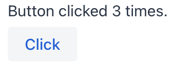
如需动态设置或更新 nativeLabel 展示文本,首先需要设置其 id 属性:
<nativeLabel id="dynamicLabel" setFor="button"/>
<button id="button" text="Click"/>
在视图控制器中,通过 id 引用这个标签,然后使用 setText() 方法更新文本:
@ViewComponent
private NativeLabel dynamicLabel;

@Subscribe("button")
public void onButtonClick(final ClickEvent<JmixButton> event) {
    dynamicLabel.setText("Button clicked " + event.getClickCount() + " times.");
}
样式版本
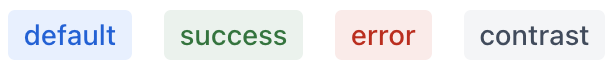
使用 themeNames 属性来自定义组件的颜色、大小和形状。首先使用 themeNames = "badge" 将组件转换为徽章。然后,使用其他主题来增强组件的视觉效果。
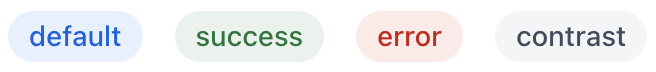
配色
有四种配色可选,用于表达组件的意图:默认、success、error`和 `contrast。
XML 代码
<nativeLabel text="default" themeNames="badge"/>
<nativeLabel text="success" themeNames="badge, success"/>
<nativeLabel text="success" themeNames="badge, warning"/>
<nativeLabel text="error" themeNames="badge, error"/>
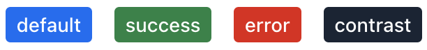
<nativeLabel text="contrast" themeNames="badge, contrast"/>将配色与 primary 主题一起使用可以更加显著地显示。
XML 代码
<nativeLabel text="default" themeNames="badge, primary"/>
<nativeLabel text="success" themeNames="badge, success, primary"/>
<nativeLabel text="success" themeNames="badge, warning, primary"/>
<nativeLabel text="error" themeNames="badge, error, primary"/>
<nativeLabel text="contrast" themeNames="badge, contrast, primary"/>
形状
应用 pill 主题会创建一个带有圆角的徽章。可独立使用或与配色主题结合使用:
XML 代码
<nativeLabel text="default" themeNames="badge, pill"/>
<nativeLabel text="success" themeNames="badge, success, pill"/>
<nativeLabel text="success" themeNames="badge, warning, pill"/>
<nativeLabel text="error" themeNames="badge, error, pill"/>
<nativeLabel text="contrast" themeNames="badge, contrast, pill"/>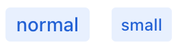
本页是否有帮助?

感谢您的反馈