dataGrid 数据网格
dataGrid 按行列展示结构化数据并支持高效的浏览大量数据。
XML 元素 |
|
|---|---|
Java 类 |
|
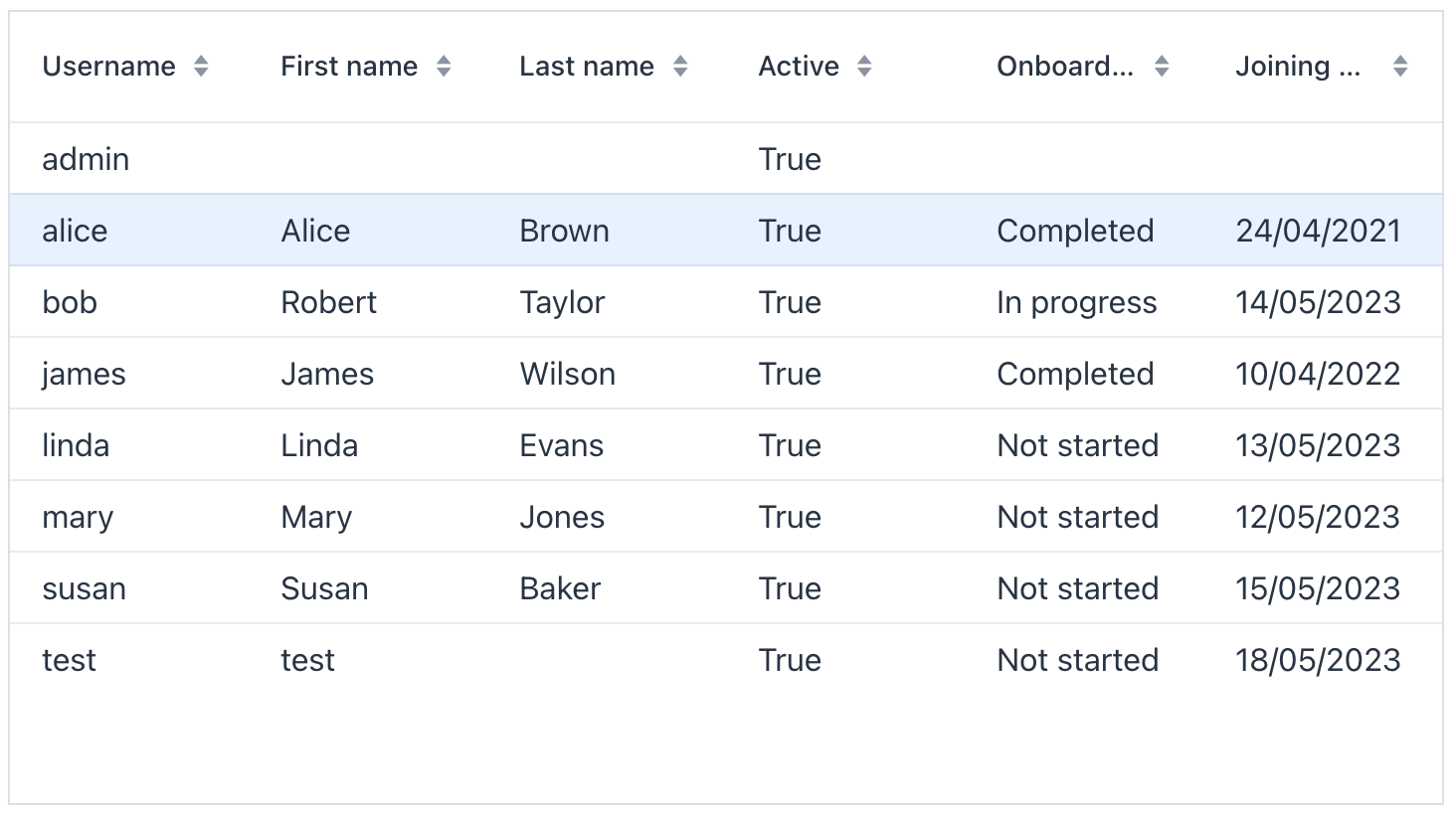
基本用法
创建该组件时,在 XML 中声明一个 dataGrid 元素,并与一个 数据容器 绑定。组件支持集合数据容器和键值对数据容器。然后,设置需要在表格中展示的属性:
该示例将数据网格与一个集合容器绑定,集合容器中的数据由 usersDl 填充。在 XML 中选择需要显示的属性,在控制器中为加载器提供数据:
<data readOnly="true">
    <collection id="ordersDc"
                class="io.jmix.uisamples.entity.Order">
        <fetchPlan extends="_local">
            <property name="customer" fetchPlan="_local"/>
        </fetchPlan>
        <loader id="ordersLoader">
            <query>
                <![CDATA[select e from uisamples_Order e order by e.date]]>
            </query>
        </loader>
    </collection>
</data>
<facets>
    <dataLoadCoordinator auto="true"/>
</facets>
<layout>
    <checkboxGroup id="dataGridSettingsGroup" label="Settings" themeNames="horizontal"/>
    <dataGrid id="dataGrid" width="100%" minHeight="20em"
              dataContainer="ordersDc">
        <columns>
            <column property="date"/>
            <column property="customer"/>
            <column property="amount"/>
            <column property="description"/>
        </columns>
    </dataGrid>
</layout>@ViewComponent
protected JmixCheckboxGroup<String> dataGridSettingsGroup;
@ViewComponent
protected DataGrid<Order> dataGrid;
@Subscribe
protected void onInit(InitEvent event) {
initSettingsGroup();
}
protected void initSettingsGroup() {
dataGridSettingsGroup.setItems("Sortable", "Resizable", "Column reordering allowed");
dataGridSettingsGroup.setTypedValue(Collections.singletonList("Sortable"));
}
@Subscribe("dataGridSettingsGroup")
protected void onDataGridSettingsGroupValueChange(
TypedValueChangeEvent<JmixCheckboxGroup<String>, Collection<String>> event) {
if (event.getValue() == null) {
return;
}
//clear
dataGrid.getAllColumns().forEach(col -> {
col.setSortable(false);
col.setResizable(false);
});
dataGrid.setColumnReorderingAllowed(false);
event.getValue()
.forEach(this::applyGridSettings);
}
protected void applyGridSettings(String setting) {
switch (setting) {
case "Sortable" -> dataGrid.getAllColumns().forEach(col -> col.setSortable(true));
case "Resizable" -> dataGrid.getAllColumns().forEach(col -> col.setResizable(true));
case "Column reordering allowed" -> dataGrid.setColumnReorderingAllowed(true);
}
}数据感知的 dataGrid
将 dataContainer 设置为显示集合容器中的实体,或显示键值对集合容器中标量和聚合查询结果。数据网格会与容器绑定,因此重新加载或更改容器会更新显示的数据。
键值对容器
当查询返回标量值或聚合值时,将网格绑定到 键值对容器。下面示例中的列对应于键值对容器声明的属性:
<data>
    <keyValueCollection id="salesDc">
        <loader id="salesLoader">
            <query>
                <![CDATA[select o.customer, sum(o.amount) from uisamples_Order o group by o.customer]]>
            </query>
        </loader>
        <properties>
            <property class="io.jmix.uisamples.entity.Customer"
                      name="customer"/>
            <property datatype="decimal"
                      name="sum"/>
        </properties>
    </keyValueCollection>
</data>
<facets>
    <dataLoadCoordinator auto="true"/>
</facets>
<layout>
    <dataGrid id="salesDataGrid"
              width="100%"
              minHeight="20em"
              dataContainer="salesDc">
        <columns>
            <column property="customer" header="Customer"/>
            <column property="sum" header="Sum"/>
        </columns>
    </dataGrid>
</layout>
编程式绑定
对于在 Java 中创建的容器,需要设置 metaClass 而不是 dataContainer,以便 XML 列可以解析实体元数据:
<dataGrid width="100%" id="dataGrid" metaClass="User">
    <columns>
        <column property="firstName"/>
        <column property="lastName"/>
        <column property="username"/>
        <column property="joiningDate"/>
        <column property="onboardingStatus"/>
    </columns>
</dataGrid>
然后,将编程式创建的容器包装在 ContainerDataGridItems 中,并将其传递给网格。该包装器通过网格的数据 provider API 将容器更改和选择状态传递给网格:
@ViewComponent
private DataGrid<User> dataGrid;

@ViewComponent
private CollectionContainer<User> usersDc;

@Subscribe
public void onInit(InitEvent event) {
    dataGrid.setItems(new ContainerDataGridItems<>(usersDc));
}
编程方式添加列
addColumn() 和 addComponentColumn() 支持在 Java 中创建列。
addColumn() 与渲染器一起使用,例如 本地日期渲染器 中展示的 LocalDateRenderer。当单元格需要包含 UI 组件时,请使用 addComponentColumn()。
下面的示例创建了一个自定义列数量的数据网格:
<hbox>
    <integerField id="columnCountField" placeholder="Number of columns" value="3">
        <validators>
            <max value="10"/>
            <min value="1"/>
        </validators>
    </integerField>
    <button id="createDataGridBtn" text="Create DataGrid"/>
</hbox>
<vbox id="box" padding="false"/>@ViewComponent
protected VerticalLayout box;
@ViewComponent
protected JmixIntegerField columnCountField;
@Autowired
protected DataComponents dataComponents;
@Autowired
protected UiComponents uiComponents;
@Autowired
protected Notifications notifications;
@Subscribe("createDataGridBtn")
protected void onCreateDataGridBtnClick(ClickEvent<JmixButton> event) {
box.removeAll();
Integer columnCount = columnCountField.getValue();
if (columnCount == null || columnCount < 1 || columnCount > 10) {
notifications.create("Column count must be between 1 and 10")
.withType(Notifications.Type.WARNING)
.withCloseable(false)
.show();
return;
}
KeyValueCollectionContainer container = createDataContainer(columnCount);
DataGrid<KeyValueEntity> dataGrid = createDataGrid(columnCount, container);
box.add(dataGrid);
}
protected DataGrid<KeyValueEntity> createDataGrid(Integer columnCount, KeyValueCollectionContainer container) {
DataGrid<KeyValueEntity> dataGrid = uiComponents.create(DataGrid.class);
dataGrid.setWidthFull();
dataGrid.setMinHeight("12em");
for (int col = 1; col <= columnCount; col++) {
dataGrid.addColumn("prop" + col, container.getEntityMetaClass().getPropertyPath("prop" + col))
.setHeader("Prop" + col);
}
dataGrid.setItems(new ContainerDataGridItems(container));
return dataGrid;
}
protected KeyValueCollectionContainer createDataContainer(Integer columnCount) {
KeyValueCollectionContainer container = dataComponents.createKeyValueCollectionContainer();
for (int col = 1; col <= columnCount; col++) {
container.addProperty("prop" + col, String.class);
}
container.setItems(loadData(columnCount));
return container;
}
protected Collection<KeyValueEntity> loadData(Integer columnCount) {
Collection<KeyValueEntity> list = new ArrayList<>();
for (int row = 0; row < 5; row++) {
KeyValueEntity entity = new KeyValueEntity();
for (int col = 1; col <= columnCount; col++) {
entity.setValue("prop" + col, "value" + row + col);
}
list.add(entity);
}
return list;
}多选模式
默认情况下,组件在单选模式运行。当设置 selectionMode 为 MULTI 时,会在第一列显示一个复选框列,支持选择多行。如果需要选中全部行,可以点击表头的复选框。
<select id="selectionModeSelect" label="Selection mode"/>
<hbox id="buttonsPanel" width="100%" wrap="true">
    <button id="greetAllBtn" action="customersDataGrid.greetAll"/>
    <button id="greetOneBtn" action="customersDataGrid.greetOne"/>
</hbox>
<dataGrid id="customersDataGrid"
          width="100%"
          minHeight="20em"
          dataContainer="customersDc">
    <actions>
        <action id="greetAll" type="list_itemTracking" icon="COMMENTS" text="Greet all"/>
        <action id="greetOne" type="list_itemTracking" icon="COMMENT" text="Greet single selected"/>
    </actions>
    <columns>
        <column property="name"/>
        <column property="lastName"/>
        <column property="email"/>
        <column property="age"/>
        <column property="active"/>
        <column property="grade"/>
    </columns>
</dataGrid>@ViewComponent
protected JmixSelect<Grid.SelectionMode> selectionModeSelect;
@ViewComponent
protected DataGrid<Customer> customersDataGrid;
@Subscribe
protected void onInit(InitEvent event) {
ComponentUtils.setItemsMap(selectionModeSelect, getSelectionModeItemsMap());
selectionModeSelect.setValue(Grid.SelectionMode.NONE);
}
@Subscribe("selectionModeSelect")
protected void onSelectionModeValueChange(
ComponentValueChangeEvent<JmixSelect<Grid.SelectionMode>, Grid.SelectionMode> event) {
customersDataGrid.setSelectionMode(event.getValue());
}
protected Map<Grid.SelectionMode, String> getSelectionModeItemsMap() {
return Arrays.stream(Grid.SelectionMode.values())
.collect(Collectors.toMap(Function.identity(), mode -> mode.name().replace('_', ' ')));
}| 使用 Shift + click 进行范围选择或其他选择的快捷键暂不支持。 |
行内编辑
|
行内编辑器仅在内存中更新实体的属性值。如果需要将修改内容保存至数据库,请使用下面的方法: |
操作列
使用 editorActionsColumn 在每行中提供 Edit 和 Close 按钮。用户可以使用这些按钮开始或结束编辑。
操作列会添加在所有列的后面,如果使用了 includeAll="true",操作列可能会在很远的最右边。
|
<dataGrid id="customersDataGridNonBuffered"
          width="100%"
          height="100%"
          minHeight="20em"
          dataContainer="customersDc">
    <columns>
        <column property="name" editable="true"/>
        <column property="lastName" editable="true"/>
        <column property="email"/>
        <column property="age"/>
        <column property="active"/>
        <column property="grade" editable="true"/>
        <editorActionsColumn key="nonBufferedEditorColumn">
            <editButton icon="PENCIL" text="msg:///actions.Edit"/>
            <closeButton icon="CHECK"/>
        </editorActionsColumn>
    </columns>
</dataGrid>
缓存模式
当 缓存模式 开启时,用户需要显式的确认或取消正在编辑的内容,以防止误操作。点击不同的表格行,会自动取消编辑。
<dataGrid id="customersDataGridBuffered"
          width="100%"
          height="100%"
          minHeight="20em"
          dataContainer="customersDc"
          editorBuffered="true">
    <columns>
        <column property="name" editable="true"/>
        <column property="lastName" editable="true"/>
        <column property="email"/>
        <column property="age"/>
        <column property="active"/>
        <column property="grade" editable="true"/>
        <editorActionsColumn key="bufferedEditorColumn">
            <editButton icon="PENCIL" text="msg:///actions.Edit"/>
            <saveButton icon="CHECK" themeNames="success"/>
            <cancelButton icon="CLOSE" themeNames="error" text="msg:///actions.Cancel"/>
        </editorActionsColumn>
    </columns>
</dataGrid>
双击编辑
有时候通过双击的方式打开行内编辑器更加方便。
<dataGrid width="100%" dataContainer="usersDc" id="dblClickTable">
    <columns>
        <column property="username"/>
        <column property="firstName" editable="true"/>
        <column property="lastName" editable="true"/>
        <column property="active" editable="true"/>
        <column property="onboardingStatus"/>
    </columns>
</dataGrid>
@ViewComponent
private DataGrid<User> dblClickTable;
@ViewComponent
private GridMenuItem<Object> emailItem;
@Subscribe
public void onInit(InitEvent event) {
DataGridEditor<User> tableEditor = dblClickTable.getEditor();
dblClickTable.addItemDoubleClickListener(e -> {
tableEditor.editItem(e.getItem());
Component editorComponent = e.getColumn().getEditorComponent();
if (editorComponent instanceof Focusable) {
((Focusable) editorComponent).focus();
}
});
}自动保存改动
在一个典型的列表视图中,加载的实体不会合并到 DataContext 中(因为 XML 中的 loader 元素具有 readOnly="true" 属性)。而且,列表视图通常不包含确认操作,如 OK 或 Save。因此,修改后的实体需要显式地保存到数据库。
在非缓存模式时,可以在 EditorCloseEvent 中通过 DataManager 保存:
在缓存模式时,可以在 EditorSaveEvent 监听器中完成。示例实现两种模式:
@Autowired
private DataManager dataManager;
@Autowired
private Notifications notifications;

@ViewComponent
private CollectionContainer<Customer> customersDc;
@ViewComponent
private CollectionLoader<Customer> customersDl;
@ViewComponent
private JmixCheckbox immediateCheckbox;
@ViewComponent
private JmixButton saveButton;

private final Set<Customer> changedCustomers = new HashSet<>();

@Install(to = "customersDataGridBuffered.@editor", subject = "saveListener")
private void customersDataGridBufferedEditorSaveListener(final EditorSaveEvent<Customer> event) {
    saveOrEnqueue(event.getItem());
}

@Install(to = "customersDataGridNonBuffered.@editor", subject = "closeListener")
private void customersDataGridNonBufferedEditorCloseListener(final EditorCloseEvent<Customer> event) {
    saveOrEnqueue(event.getItem());
}

@Subscribe("immediateCheckbox")
public void onImmediateCheckboxComponentValueChange(final AbstractField.ComponentValueChangeEvent<JmixCheckbox, Boolean> event) {
    saveButton.setEnabled(!event.getValue());
}

@Subscribe(id = "saveButton", subject = "clickListener")
public void onSaveButtonClick(final ClickEvent<JmixButton> event) {
    saveEnqueuedChanges();
}

private void saveOrEnqueue(Customer customer) {

    if (immediateCheckbox.getValue()) {
        saveChanges(customer);
    } else {
        changedCustomers.add(customer);
    }
}

private void saveChanges(Customer customer) {
    // Save changed entity
    Customer savedCustomer = dataManager.save(customer);
    // Replace the original entity in the data container with the saved one
    customersDc.replaceItem(savedCustomer);
    // Note that if the original entity is merged into DataContext (this is the
    // case when <loader readOnly="false">), the saved instance should be merged too
    notifications.show("Changes saved to the database");
}

private void saveEnqueuedChanges() {
    if (!changedCustomers.isEmpty()) {
        // Save enqueued changes. The returned value is ignored because all data will be reloaded.
        dataManager.saveAll(changedCustomers);
        changedCustomers.clear();
        notifications.show("Changes saved to the database");
        customersDl.load();
    }
}|
如需通过 Jmix Studio 生成监听器注解方法,可以在 Component Inspector 的 Handlers 标签页中生成,这里的编辑器事件监听器带 监听器也可以编程式通过类似 |
DataGridEditor
io.jmix.flowui.component.grid.editor.DataGridEditor 接口提供了额外的编辑器功能:配置一个编辑器、打开编辑器、保存或取消行编辑,注册监听器,以及定义列编辑组件的工具方法。
为了支持框架的机制,例如数据容器、值来源等,列编辑器组件必须通过 DataGridEditor 的 DataGridEditor#setColumnEditorComponent() 方法添加,而不能直接使用列 API Column#setEditorComponent()。
|
参考示例:
@Autowired
private UiComponents uiComponents;

@ViewComponent
private DataGrid<User> editableUserTable;

@Subscribe
public void onInit(InitEvent event) {
    DataGridEditor<User> editor = editableUserTable.getEditor(); (1)

    editor.setColumnEditorComponent("timeZoneId", generationContext -> {
        //noinspection unchecked
        JmixComboBox<String> timeZoneField = uiComponents.create(JmixComboBox.class); (2)
        timeZoneField.setItems(List.of(TimeZone.getAvailableIDs()));
        timeZoneField.setValueSource(generationContext.getValueSourceProvider().getValueSource("timeZoneId"));
        timeZoneField.setWidthFull();
        timeZoneField.setClearButtonVisible(true);
        timeZoneField.setRequired(true);
        //noinspection unchecked,rawtypes
        timeZoneField.setStatusChangeHandler(((Consumer) generationContext.getStatusHandler())); (3)

        return timeZoneField; (4)
    });
}| 1 | 获取 DataGridEditor 实例。 |
| 2 | JmixComboBox 组件实例用 UiComponents 工厂创建。 |
| 3 | 设置 StatusChangeHandler。 |
| 4 | setColumnEditorComponent() 方法返回的可视化组件将作为列编辑组件。 |
Header 和 Footer
组件可以包含 header 和 footer 以显示补充信息。补充信息可以是一行或多行,通过下列方法添加:
方法 |
描述 |
|---|---|
|
在 header 块的底部添加一行。 |
|
在 header 块的顶部添加一行。 |
|
在 footer 块的底部添加一行。 |
|
在 footer 块的顶部添加一行。 |
下面的示例中,dataGrid 的 header 显示合并的单元格,而 footer 显示一些计算值:
<dataGrid id="dataGrid"
          width="100%"
          minHeight="20em"
          dataContainer="countryGrowthDc"
          themeNames="column-borders row-stripes">
    <columns>
        <column property="country"/>
    </columns>
</dataGrid>@ViewComponent
protected DataGrid<CountryGrowth> dataGrid;
@Autowired
protected MessageTools messageTools;
@Autowired
protected Metadata metadata;
protected DecimalFormat percentFormat;
@Subscribe
protected void onInit(InitEvent event) {
initPercentFormat();
initColumns();
initHeader();
}
@Subscribe
protected void onBeforeShow(BeforeShowEvent event) {
//because data is loaded
initFooter();
}
protected void initPercentFormat() {
percentFormat = (DecimalFormat) NumberFormat.getPercentInstance(UI.getCurrent().getLocale());
percentFormat.setMultiplier(1);
percentFormat.setMaximumFractionDigits(2);
}
protected void initColumns() {
MetaClass metaClass = metadata.getClass(CountryGrowth.class);
dataGrid.addComponentColumn(countryGrowth -> new Text(percentFormat.format(countryGrowth.getPrevYear())))
.setHeader(messageTools.getPropertyCaption(metaClass, "prevYear"))
.setKey("prevYear");
dataGrid.addComponentColumn(countryGrowth -> new Text(percentFormat.format(countryGrowth.getCurrYear())))
.setHeader(messageTools.getPropertyCaption(metaClass, "currYear"))
.setKey("currYear");
}
protected void initHeader() {
HeaderRow headerRow = dataGrid.prependHeaderRow();
HeaderRow.HeaderCell headerCell = headerRow.join(
dataGrid.getColumnByKey("prevYear"),
dataGrid.getColumnByKey("currYear")
);
Span gdpGrowth = new Span("GDP growth");
HorizontalLayout layout = new HorizontalLayout(gdpGrowth);
layout.setJustifyContentMode(FlexComponent.JustifyContentMode.CENTER);
headerCell.setComponent(layout);
}
protected void initFooter() {
FooterRow footerRow = dataGrid.appendFooterRow();
FooterRow.FooterCell countryCell = footerRow.getCell(dataGrid.getColumnByKey("country"));
Html html = new Html("<strong> Average: </strong>");
countryCell.setComponent(html);
footerRow.getCell(dataGrid.getColumnByKey("prevYear"))
.setText(percentFormat.format(getAverage("prevYear")));
footerRow.getCell(dataGrid.getColumnByKey("currYear"))
.setText(percentFormat.format(getAverage("currYear")));
}
protected double getAverage(String propertyId) {
double average = 0.0;
Collection<CountryGrowth> items = dataGrid.getGenericDataView().getItems().toList();
for (CountryGrowth countryGrowth : items) {
Double value = propertyId.equals("prevYear")
? countryGrowth.getPrevYear()
: countryGrowth.getCurrYear();
average += value != null ? value : 0.0;
}
return average / items.size();
}表头过滤
可以使用表头中的 属性过滤器 按单独过滤列数据。可过滤的列会在其表头中显示一个漏斗图标( )。点击该图标会打开过滤器对话框。
设置 columns 元素的 filterable 属性为 true,可启用对实体属性的所有列的过滤。如需为单个列启用或禁用过滤,可以在 column 元素上设置 filterable。column 上的设置优先于 columns 上的设置:
<dataGrid id="customersDataGrid"
          width="100%"
          minHeight="20em"
          dataContainer="customersDc">
    <columns>
        <column property="name" filterable="true"/>
        <column property="lastName"/>
        <column property="email"/>
        <column property="age" filterable="true"/>
        <column property="active" filterable="true"/>
        <column property="grade" filterable="true"/>
    </columns>
</dataGrid>| 可以为表头过滤器配置键盘快捷键。请参见 headerFilterApplyShortcut 或 jmix.ui.component.data-grid-header-filter-apply-shortcut 进行全局配置。 |
与独立的 propertyFilter 和 genericFilter 通用过滤器 组件一样,表头过滤器会将过滤条件添加到 数据加载器 中。在标准数据加载流程中,条件会被转换为 JPQL 并在数据库层面执行。所有过滤器的条件使用逻辑 AND 组合。
|
可以将 |
| 表头过滤器会将其条件添加到数据加载器条件中,因此 过滤器组件与加载器条件 中的规则同样有效。特别是,不要在视图初始化后以编程方式替换加载器条件。否则,表头过滤器条件可能不会被包含在查询条件中,而列仍然显示为已过滤。 |
操作
|
如需在 Jmix Studio 中添加 |
<hbox id="buttonsPanel" width="100%" wrap="true">
    <button id="createBtn" action="customersDataGrid.create"/>
    <button id="editBtn" action="customersDataGrid.edit"/>
    <button id="removeBtn" action="customersDataGrid.remove"/>
    <button id="greetingBtn" action="customersDataGrid.greeting"/>
</hbox>
<dataGrid id="customersDataGrid"
          width="100%"
          minHeight="20em"
          dataContainer="customersDc">
    <actions>
        <action id="create" type="list_create">
            <properties>
                <property name="openMode" value="DIALOG"/>
            </properties>
        </action>
        <action id="edit" type="list_edit">
            <properties>
                <property name="openMode" value="DIALOG"/>
            </properties>
        </action>
        <action id="remove" type="list_remove"/>
        <action id="greeting" type="list_itemTracking" icon="COMMENT" text="Greeting"/>
    </actions>
    <columns>
        <column property="name"/>
        <column property="lastName"/>
        <column property="email"/>
        <column property="age"/>
        <column property="active"/>
        <column property="grade"/>
    </columns>
</dataGrid>@ViewComponent
protected DataGrid<Customer> customersDataGrid;
@Autowired
protected Notifications notifications;
@Autowired
protected MetadataTools metadataTools;
@Subscribe("customersDataGrid.greeting")
protected void onCustomersDataGridGreetingActionPerformed(ActionPerformedEvent event) {
Customer customer = customersDataGrid.getSingleSelectedItem();
notifications.show(customer != null
? "Hello, " + metadataTools.getInstanceName(customer)
: "No selection");
}右键菜单
右键菜单提供了另一种访问 操作 的方式。每个操作显示为一个菜单项。
使用 contextMenu 元素可以优化菜单项列表,使用分隔符或层次结构进行组织。
<hbox id="buttonsPanel" width="100%" wrap="true">
    <button id="createBtn" action="customersDataGrid.create"/>
    <button id="editBtn" action="customersDataGrid.edit"/>
    <button id="removeBtn" action="customersDataGrid.remove"/>
    <button id="greetingBtn" action="customersDataGrid.greeting"/>
</hbox>
<dataGrid id="customersDataGrid"
          width="100%"
          minHeight="20em"
          dataContainer="customersDc">
    <contextMenu id="contextMenu">
        <item text="CRUD" icon="TABLE">
            <item action="customersDataGrid.create" icon="PLUS"/>
            <item action="customersDataGrid.edit" icon="PENCIL"/>
            <item action="customersDataGrid.remove" icon="TRASH"/>
        </item>
        <item action="customersDataGrid.greeting" icon="COMMENT"/>
        <separator/>
        <item id="customerItem"/>
        <item action="customersDataGrid.getInfo" icon="INFO_CIRCLE"/>
    </contextMenu>
    <actions showInContextMenuEnabled="false">
        <action id="create" type="list_create">
            <properties>
                <property name="openMode" value="DIALOG"/>
            </properties>
        </action>
        <action id="edit" type="list_edit">
            <properties>
                <property name="openMode" value="DIALOG"/>
            </properties>
        </action>
        <action id="remove" type="list_remove"/>
        <action id="greeting" type="list_itemTracking" icon="COMMENT" text="Greeting"/>
        <action id="getInfo" type="list_itemTracking" icon="INFO_CIRCLE" text="Get info"/>
    </actions>
    <columns>
        <column property="name"/>
        <column property="lastName"/>
        <column property="email"/>
        <column property="age"/>
        <column property="active"/>
        <column property="grade"/>
    </columns>
</dataGrid>@ViewComponent
protected DataGrid<Customer> customersDataGrid;
@Autowired
protected Notifications notifications;
@Autowired
protected Dialogs dialogs;
@Autowired
protected MetadataTools metadataTools;
@ViewComponent
protected GridMenuItem<Customer> customerItem;
@Install(to = "contextMenu", subject = "dynamicContentHandler")
public boolean contextMenuDynamicContentHandler(Customer customer) {
if (customer == null) {
return false;
}
customerItem.setText(metadataTools.getInstanceName(customer));
return true;
}
@Subscribe("customersDataGrid.greeting")
public void onCustomersDataGridGreetingActionPerformed(ActionPerformedEvent event) {
Customer customer = customersDataGrid.getSingleSelectedItem();
notifications.show(customer != null
? "Hello, " + metadataTools.getInstanceName(customer)
: "No selection");
}
@Subscribe("customersDataGrid.getInfo")
public void onCustomersDataGridGetInfoActionPerformed(ActionPerformedEvent event) {
Customer customer = customersDataGrid.getSingleSelectedItem();
dialogs.createMessageDialog()
.withContent(
customer != null
? getMessageDialogContent(customer)
: new Span("No selection")
)
.open();
}
protected Component getMessageDialogContent(Customer customer) {
return new Html("""
<div>
<strong>Name:</strong> %s<br/>
<strong>Age:</strong> %s<br/>
<strong>Email:</strong> %s
</div>
""".formatted(metadataTools.getInstanceName(customer), customer.getAge(), customer.getEmail()));
}渲染器
渲染器用于自定义列单元格的显示方式。本节介绍 dataGrid 的多种列渲染器。通用的渲染器 API,如 ComponentRenderer、LitRenderer 和 FragmentRenderer,在 渲染器 中介绍。
渲染器可以通过以下几种方式定义:
-
在 XML 中声明式定义:在
column元素内部使用预定义渲染器,例如numberRenderer、localDateRenderer、localDateTimeRenderer、detailLinkRenderer、detailButtonRenderer和popoverRenderer。 -
使用
@Supply注解:在视图控制器中提供自定义渲染器。 -
使用
fragmentRenderer:使用基于 fragment 的渲染器机制,详见 Fragment 渲染器。 -
使用
addColumn()和addComponentColumn():在 Java 中创建列并以编程方式配置渲染器。请参见 编程方式添加列。
|
如需在 Jmix Studio 中添加渲染器,请在视图的 XML 或 Jmix UI 的结构面板中选择 |
本地日期渲染器
在列单元格中渲染 LocalDate 值。
<column property="joiningDate">
    <localDateRenderer format="MMM dd, yyyy"/>
</column>
使用 format 属性定义输出格式。可选的 nullRepresentation 属性可以指定 null 值的显示方式。
对于 Java 代码配置,使用 addColumn() 和 LocalDateRenderer:
@ViewComponent
private DataGrid<User> usersDtGr;

@Subscribe
public void onInit(InitEvent event) {
    usersDtGr.addColumn(new LocalDateRenderer<>(
                    User::getJoiningDate,
                    () -> DateTimeFormatter.ofLocalizedDate(
                            FormatStyle.MEDIUM)))
            .setHeader("Joining date");
}
本地日期时间渲染器
在列单元格中渲染 LocalDateTime 值。
<column property="passwordExpiration">
    <localDateTimeRenderer format="dd/MM/YYYY HH:mm:ss"/>
</column>
使用 format 属性定义输出格式。可选的 nullRepresentation 属性可以指定 null 值的显示方式。
数字渲染器
在列单元格中渲染数字值。
<column property="factor">
    <numberRenderer numberFormat="#,#00.0000"/>
</column>
必须配置 format 或 numberFormat 中的一个。如果两者都未配置,或者两者同时配置,框架会抛出 GuiDevelopmentException。可选的 nullRepresentation 属性可以指定 null 值的显示方式。numberFormat 使用 java.text.DecimalFormat 语法。
详情链接渲染器
渲染一个链接,用于打开当前实体的详情视图。
<dataGrid width="100%" dataContainer="usersDc">
    <columns>
        <column property="username">
            <detailLinkRenderer viewId="User.detail"
                                target="BLANK"
                                classNames="detail-link"
                                css="font-weight: 600;"/>
        </column>
        <column property="firstName"/>
        <column property="lastName"/>
    </columns>
</dataGrid>
支持的属性:
-
viewClass、viewId用于指定目标视图。渲染器按以下顺序解析视图:viewClass、viewId、默认详情视图。 -
text设置链接文本。如果省略,渲染器使用列属性的格式化值。 -
target设置链接目标。 -
classNames、css用于配置样式。
目标视图必须已注册一个路由,且路由参数恰好为一个,实体实例必须有非空的 id。对于零个或多个路由参数的路由,需要从 Java 代码配置渲染器,并使用 DetailLinkRenderer.withHrefProvider() 提供自定义 URL。
详情按钮渲染器
渲染一个按钮,用于打开当前实体的详情视图。
<dataGrid width="100%" dataContainer="stepsDc">
    <columns>
        <column property="name">
            <detailButtonRenderer viewId="Step.detail"
                                  icon="vaadin:edit"
                                  openMode="DIALOG"
                                  themeNames="tertiary-inline small"
                                  classNames="detail-button"
                                  css="color: var(--lumo-primary-text-color);"/>
        </column>
        <column property="duration"/>
        <column property="sortValue"/>
    </columns>
</dataGrid>
支持的属性:
-
viewClass、viewId用于指定目标视图。渲染器按以下顺序解析视图:viewClass、viewId、默认详情视图。 -
openMode控制视图的打开方式:NAVIGATION(默认)或DIALOG。 -
text设置按钮文本。如果省略,渲染器使用列属性的格式化值。对于仅含 key 的列,请手动设置该值。 -
icon设置按钮图标。可以通过属性或嵌套的icon元素来定义。 -
themeNames、classNames、css用于配置样式。
仅含 key 的列中的详情渲染器
可以在使用 key 而非 property 属性的列中使用详情渲染器:
<dataGrid width="100%" dataContainer="usersDc">
    <columns>
        <column property="username"/>
        <column key="openUser" header="Open">
            <detailButtonRenderer viewId="User.detail"
                                  text="Edit"
                                  openMode="DIALOG"/>
        </column>
    </columns>
</dataGrid>
此时,由于没有绑定的属性值,需要手动设置链接或按钮的 text。
弹出框渲染器
Jmix 3.1+
将列属性的值渲染为文本,如果文本不适合单元格,则用省略号截断。当用户点击单元格时,弹出框显示完整文本。对于长文本属性(如描述和注释),请使用此渲染器。

<dataGrid id="hobbiesDataGrid" width="100%" dataContainer="hobbiesDc">
    <columns>
        <column property="name" width="10em" flexGrow="0"/>
        <column property="description">
            <popoverRenderer position="TOP_START"
                             classNames="hobby-description"/>
        </column>
    </columns>
</dataGrid>
支持的属性:
-
position设置弹出框相对于单元格的位置。使用PopoverPosition枚举值,例如BOTTOM_START(默认)、TOP_START或END。 -
classNames为单元格和弹出框添加类名。 -
css为单元格设置内联 CSS。不应用于弹出框。
在 XML 中,渲染器从列的 property 获取文本,因此列必须具有此属性。如果属性值为空,则单元格为空。
弹出框不是单元格的子元素,因此单元格的 CSS 选择器无法选中弹出框。如需设置特定弹出框样式,请使用 classNames 属性中的类名。弹出框的大小受 --jmix-popover-renderer-max-width(默认 30rem)和 --jmix-popover-renderer-max-height(默认 20rem)CSS 自定义属性限制。如果文本特别长,用户可以在弹出框中滚动查看。以下 CSS 更改上面示例的弹出框大小:
.jmix-popover-renderer-popover.hobby-description {
    --jmix-popover-renderer-max-width: 40rem;
    --jmix-popover-renderer-max-height: 15rem;
}
内置样式使用 jmix-popover-renderer-button 类名表示单元格,jmix-popover-renderer-popover 表示弹出框,jmix-popover-renderer-content 表示弹出框中的文本。
对于 Java 端配置,创建一个 PopoverRenderer,并提供一个返回文本的函数。文本不必是属性值,因此该渲染器也适用于有 key 的列:
<column key="details" header="Details"/>@Supply(to = "hobbiesKeyDataGrid.details", subject = "renderer")
private Renderer<Hobby> hobbiesKeyDataGridDetailsRenderer() {
return new PopoverRenderer<Hobby>(hobby ->
hobby.getDescription() == null
? null
: hobby.getName() + ": " + hobby.getDescription())
.withPosition(PopoverPosition.END)
.withClassNames("hobby-description");
}withPosition()、withClassNames() 和 withCss() 方法与 XML 属性对应。如需在单元格中显示不同的组件,请将创建该组件的函数作为第二个构造函数参数传入。
文本渲染器
渲染 Java 代码提供的纯文本。
<column key="status" header="Status"/>@Supply(to = "userStepsDataGrid.status", subject = "renderer")
private Renderer<UserStep> userStepsDataGridStatusRenderer() {
return new TextRenderer<>(userStep ->
isOverdue(userStep) ? "Overdue!" : "");
}该渲染器通常通过 renderer 处理方法或 @Supply 注解在 Java 代码提供。
组件渲染器
在单元格内渲染自定义组件。当单元格需要包含丰富或可交互的内容(复选框、图片、按钮等)时,请使用该渲染器。
| 参阅 组件渲染器 了解可用的构造器、通用行为以及性能。 |
下面的示例中,在 active 列渲染了一个只读的复选框,在 grade 列渲染了一个徽标。
<dataGrid id="customersDataGrid"
          width="100%"
          minHeight="20em"
          dataContainer="customersDc">
    <columns>
        <column property="name"/>
        <column property="lastName"/>
        <column property="email"/>
        <column property="age"/>
        <column property="active"/>
        <column property="grade"/>
    </columns>
</dataGrid>@Autowired
protected UiComponents uiComponents;
@Autowired
protected Messages messages;
@Supply(to = "customersDataGrid.active", subject = "renderer")
protected Renderer<Customer> activeComponentRenderer() {
return new ComponentRenderer<>(
() -> {
JmixCheckbox checkbox = uiComponents.create(JmixCheckbox.class);
checkbox.setReadOnly(true);
return checkbox;
},
(checkbox, customer) -> checkbox.setValue(customer.isActive())
);
}
@Supply(to = "customersDataGrid.grade", subject = "renderer")
protected Renderer<Customer> statusComponentRenderer() {
return new ComponentRenderer<>(this::createGradeComponent, this::gradeComponentUpdater);
}
protected Badge createGradeComponent() {
return uiComponents.create(Badge.class);
}
protected void gradeComponentUpdater(Badge badge, Customer customer) {
badge.getElement().getThemeList().clear();
CustomerGrade grade = customer.getGrade();
if (grade == null) {
badge.setText("No data");
return;
}
badge.setText(messages.getMessage(CustomerGrade.class, grade.name()));
if (grade == CustomerGrade.HIGH) {
badge.addThemeVariants(BadgeVariant.SUCCESS);
} else if (grade == CustomerGrade.PREMIUM) {
badge.addThemeVariants(BadgeVariant.FILLED);
}
}条目详情
组件中的行可以展开,以显示每行的附加信息。通过 setItemDetailsRenderer() 方法可以实现该功能。方法使用一个 ComponentRenderer 作为参数,提供内容的渲染方式。
detailsVisibleOnClick 属性可以设置当点击特定行时,是否显示详细信息。如果需要通过其他事件触发详情展示,可以设置该属性为 false。
<dataGrid id="customersDataGrid"
          width="100%"
          minHeight="20em"
          dataContainer="customersDc">
    <columns>
        <column property="name"/>
        <column property="lastName"/>
    </columns>
</dataGrid>@ViewComponent
protected DataGrid<Customer> customersDataGrid;
@Autowired
protected CustomerDetailsGenerator detailsGenerator;
@Subscribe
protected void onInit(InitEvent event) {
detailsGenerator.setReadOnlyMode(true);
customersDataGrid.setItemDetailsRenderer(createCustomerDetailsRenderer());
}
protected ComponentRenderer<FormLayout, Customer> createCustomerDetailsRenderer() {
return new ComponentRenderer<>(detailsGenerator::createCustomerDetailsRenderer, detailsGenerator::setCustomer);
}排序
本节演示了针对单个 dataGrid 组件的自定义排序。关于应用程序范围的自定义排序,请参见 排序。
|
任何列都可用于对数据进行排序。单击列标题可激活表格中的特殊控件,该控件显示当前正在排序的列以及排序的顺序(升序或降序)。随后每次单击同一标题都可以切换排序的顺序。
|
枚举 类型的属性按 因此,在 |
多列排序
也可以同时按多列进行排序。按多列排序时,第一个选定的列确定主要排序条件,第二列设置次要排序条件,依此类推。可以使用 multiSort、multiSortOnShiftClickOnly 和 multiSortPriority 属性配置多列排序。
示例:
<dataGrid id="customersDataGrid"
          width="100%"
          minHeight="20em"
          dataContainer="customersDc"
          multiSort="true"
          multiSortPriority="APPEND">
    <columns>
        <column property="name"/>
        <column property="lastName"/>
        <column property="email"/>
        <column property="age"/>
        <column property="active"/>
        <column property="grade"/>
    </columns>
</dataGrid>
列比较器
使用 DataGridColumn#setComparator() 可以自定义列的内存排序逻辑。当数据容器没有加载器,或者仅加载了第一页且加载的条目数小于页面大小时,会使用内存排序。
以下示例将 Department.num 属性按数值排序,即使类型为 String:
<dataGrid id="inMemoryDepartmentsDataGrid"
          width="100%"
          dataContainer="inMemoryDepartmentsDc">
    <columns>
        <column property="name"/>
        <column property="num"/>
    </columns>
</dataGrid>
private void initInMemoryComparator() {
inMemoryDepartmentsDc.setItems(dataManager.load(Department.class)
.query("select e from Department e")
.list());
inMemoryDepartmentsDataGrid.getColumnByKey("num")
.setComparator(Comparator.comparing(
department -> department.getNum() == null ? null : Integer.valueOf(department.getNum()),
Comparator.nullsFirst(Integer::compareTo)));
}排序 Builder 委托
如果表格从数据库重新加载数据,需要配置排序 builder 委托。该委托从表格接收排序指令,并返回一个 DataGridSort 对象,支持在同一处代码中覆盖内存排序、数据库排序。
以下示例将 customer 列按名称和姓氏排序:
<simplePagination id="pagination"
                  dataLoader="ordersDl"
                  itemsPerPageDefaultValue="4"/>
<dataGrid id="ordersDataGrid"
          width="100%"
          minHeight="20em"
          dataContainer="ordersDc">
    <columns>
        <column property="date"/>
        <column property="customer"/>
        <column property="amount"/>
    </columns>
</dataGrid>@Install(to = "ordersDataGrid", subject = "sortBuilderDelegate")
public DataGridSort ordersDataGridSortBuilderDelegate(DataGridSortContext<Order> context) {
return DataGridSortBuilder.create(context)
.replaceSort("customer", List.of("{E}.customer.name", "{E}.customer.lastName"))
.build();
}计算列排序
排序 builder 委托对于未绑定实体属性的列也有效。下面的示例中,fullName 列由 firstName 和 lastName 渲染生成,排序 builder 委托将该合成列映射至 JPQL 表达式和内存比较器:
<dataGrid id="fullNameUsersDataGrid"
          width="100%"
          dataContainer="usersDc">
    <columns>
        <column key="fullName" header="Full name" sortable="true"/>
        <column property="username"/>
        <column property="department.name"/>
        <column property="onboardingStatus"/>
    </columns>
</dataGrid>
private void initComputedColumnSortBuilder() {
fullNameUsersDataGrid.setSortBuilderDelegate(sortContext ->
DataGridSortBuilder.create(sortContext)
.replaceSort("fullName",
List.of("{E}.firstName", "{E}.lastName"),
Comparator.comparing(User::getFirstName,
Comparator.nullsFirst(String::compareTo))
.thenComparing(User::getLastName,
Comparator.nullsFirst(String::compareTo)))
.build());
}
@Supply(to = "fullNameUsersDataGrid.fullName", subject = "renderer")
protected Renderer<User> fullNameUsersDataGridFullNameRenderer() {
return new TextRenderer<>(user ->
((user.getFirstName() == null ? "" : user.getFirstName()) + " "
+ (user.getLastName() == null ? "" : user.getLastName())).trim());
}聚合
dataGrid 可以对行内值进行聚合。当启用聚合时,会显示一个附加行,包含聚合值。示例:
<dataGrid id="ordersDataGrid"
          width="100%"
          minHeight="20em"
          dataContainer="ordersDc"
          aggregatable="true"
          aggregationPosition="TOP">
    <columns>
        <column property="date"/>
        <column property="customer"/>
        <column property="customer.grade">
            <aggregation
                    strategyClass="io.jmix.uisamples.view.flowui.components.datagrid.aggregation.DataGridCustomerGradeAggregation"/>
        </column>
        <column property="amount">
            <aggregation type="SUM"/>
        </column>
        <column property="description"/>
    </columns>
</dataGrid>
aggregation 元素还可以通过 strategyClass 属性设置一个用于自定义聚合计算的类:
该类需要实现 AggregationStrategy 接口。示例:
@Autowired
private Messages messages;

@Override
public String aggregate(Collection<CustomerGrade> propertyValues) {
    CustomerGrade mostFrequent = null;
    long max = 0;

    if (CollectionUtils.isNotEmpty(propertyValues)) {
        for (CustomerGrade grade : CustomerGrade.values()) {
            long current = propertyValues.stream()
                    .filter(grade::equals)
                    .count();

            if (current > max) {
                mostFrequent = grade;
                max = current;
            }
        }
    }

    if (mostFrequent != null) {
        String key = CustomerGrade.class.getSimpleName() + "." + mostFrequent.name();
        return String.format("%s: %d/%d", messages.getMessage(CustomerGrade.class, key), max, propertyValues.size());
    }

    return "NaN";
}

@Override
public Class<String> getResultClass() {
    return String.class;
}
空状态
当数据网格没有数据可供展示时,表格中间的数据显示区默认为空。此时可以利用空状态的功能显示一条消息或 UI 组件,告诉用户目前没有数据。
-
通过
emptyStateText属性可以定义空状态的文本。<dataGrid id="dataGridEmptyState" dataContainer="customersDc" width="100%" emptyStateText="No customers found"> <columns> <column property="firstName"/> <column property="lastName"/> <column property="age"/> <column property="martialStatus"/> </columns> </dataGrid>该属性的优先级高于在 Java 中通过 setEmptyStateComponent(Component)或 XML 中通过emptyStateComponent设置的空状态元素。即,设置emptyStateText会自动移除所有已经存在的组件。 -
使用
emptyStateComponent元素定义空状态显示的组件。<hbox id="buttonsPanel" width="100%" wrap="true"> <button id="unloadBtn" action="customersDataGrid.unload"/> </hbox> <dataGrid id="customersDataGrid" width="100%" minHeight="20em" dataContainer="customersDc"> <actions> <action id="unload" icon="ERASER" text="msg://customersDataGrid.unload.text" enabled="false"/> </actions> <columns> <column property="name"/> <column property="lastName"/> <column property="email"/> <column property="age"/> <column property="active"/> <column property="grade"/> </columns> <emptyStateComponent> <vbox padding="false" height="100%" justifyContent="CENTER" alignItems="CENTER"> <h3 text="msg://emptyState.text"/> <button id="loadBtn" text="msg://loadBtn.text" icon="REFRESH" themeNames="primary"/> </vbox> </emptyStateComponent> </dataGrid>@ViewComponent private CollectionContainer<Customer> customersDc; @ViewComponent private CollectionLoader<Customer> customersDl; @ViewComponent("customersDataGrid.unload") private Action unloadAction; @Subscribe("customersDataGrid.unload") public void onCustomersDataGridUnloadActionPerformed(ActionPerformedEvent event) { customersDc.getMutableItems().clear(); unloadAction.setEnabled(false); } @Subscribe("loadBtn") public void onLoadBtnClick(ClickEvent<JmixButton> event) { customersDl.load(); unloadAction.setEnabled(true); }一旦设置了
emptyStateComponent后,就可以与这些空状态的元素进行交互。比如自定义组件的样式或创建组件的事件监听器。设置该元素会覆盖在视图控制器中通过 setEmptyStateText(String)方法或在 XML 中通过emptyStateText定义的空状态文字。
样式版本
使用 themeNames 属性设置组件的样式。
| 样式 | 描述 | 支持的主题 |
|---|---|---|
|
在列之间添加垂直边框 |
Aura, Lumo |
|
减小行高和间距 |
Lumo |
|
移除表格的外边框 |
Aura, Lumo |
|
移除行之间的水平边框 |
Aura, Lumo |
|
交替行背景色以提升可读性 |
Aura, Lumo |
|
允许单元格内容换行显示,而不是截断 |
Aura, Lumo |
XML 属性
下面是 dataGrid 的特殊属性:
| 名称 | 描述 | 默认值 |
|---|---|---|
如果设置为 如果有大量数据,会有性能问题,此时不推荐使用该功能。 |
|
|
如果设置为 |
|
|
|
||
如果设置为 |
|
|
如果设置为 |
|
|
设置行的拖放模式。支持 |
- |
|
如果设置为 |
|
|
当表格无数据时显示的文本。使用 null 移除当前空状态的内容。参阅 空状态。 |
– |
|
如果设置为 |
|
|
如果设置为 |
|
|
设置点击的列添加到排序列中的位置。支持 |
|
|
设置解析可能包含 |
|
|
设置每页展示的行数,这个数值也是每次从数据提供器中获取的数量。 |
|
|
如果设置为 |
|
|
设置选择模式。支持 |
|
事件和处理器
下面是 dataGrid 的特殊事件和处理器:
| 名称 | 描述 |
|---|---|
|
|
|
|
|
|
|
|
|
|
|
|
|
|
|
|
|
|
为数据网格添加数据生成器。如果生成器已添加,则不执行任何操作。请参见 |
|
确定在启用 rowsDraggable 时可以拖动哪些行。 |
|
确定哪些行是有效的放置目标。 |
|
处理用户按下 Enter 键时的事件。 |
|
确定用户是否可以选中或取消选中特定条目。 |
|
根据单元格的内容生成 CSS 部件名称,从而实现条件单元格样式。 |
|
根据单元格的内容生成提示文本。请参见 在线示例。 |
下面是 dataGrid 支持的其他通用事件:
XML 内部元素
dataGrid 的 XML 内部元素提供很多选项来控制列的外观、行为和功能,既可以集中控制列,也可以单独控制列的功能。
|
如需为选择的组件添加内部元素,可以使用 Jmix UI 组件属性面板中的 Add 按钮添加。 |
columns
columns 元素可以设置一组需要展示的属性,并设置所有列的行为。
XML 元素 |
|
|---|---|
属性 |
exclude - filterable - headerFilterApplyShortcut - includeAll - resizable - sortable |
XML 内部元素 |
名称 |
描述 |
默认值 |
|---|---|---|
排除特定的属性卡不予展示。多个属性需要使用逗号分隔。示例: |
- |
|
如果为 |
|
|
– |
||
如果为 |
- |
|
如果设置为 |
|
|
如果设置为 |
|
column
column 元素定义一个单独的列。为单独列设置的属性会覆盖为所有列设置的属性。
XML 元素 |
|
|---|---|
属性 |
autowidth - editable - filterable - flexGrow - footer - frozen - frozenToEnd - header - key - property - resizable - sortable - textAlign - visible - width |
事件和处理器 |
AttachEvent - DataGridColumnVisibilityChangedEvent - DetachEvent - partNameGenerator - renderer - tooltipGenerator |
XML 内部元素 |
Aggregation - FragmentRenderer - LocalDateRenderer - LocalDateTimeRenderer - NumberRenderer - DetailLinkRenderer - DetailButtonRenderer - PopoverRenderer |
名称 |
描述 |
默认值 |
|---|---|---|
如果设置为 |
|
|
如果设置为 |
|
|
如果设置为 |
|
|
设置列的 flex grow 比例。当设置为 |
|
|
为列设置一个 footer 文本。该属性可以是文本本身或者 消息包 中的一个键值。如果是消息包键值,则必须以 |
- |
|
如果设置为 |
|
|
如果为 |
|
|
为列设置一个 header 文本。该属性可以是文本本身或者 消息包 中的一个键值。如果是消息包键值,则必须以 |
- |
|
设置用户定义的列映射 id。这个键值可以用来通过 键值必须在同一个数据网格中唯一,设定后不能更改。 |
- |
|
指定列中需要显示的实体属性。可以是根实体的属性 |
- |
|
如果设置为 |
|
|
如果设置为 |
|
|
设置文本的对其方式,支持 |
|
|
如果设置为 |
|
|
设置列宽,宽度单位为 |
- |
名称 |
描述 |
|---|---|
通过 gridColumnVisibility 列可见性 组件修改列可见性时发送。 |
|
按照给定条件为列生成 CSS 类的 part。此功能可以根据展示的数据修改单元格的外观。参考 在线示例。 |
|
按照给定条件为列生成提示窗。参考 在线示例。 |
contextMenu
contextMenu 元素可以使用与其默认排列方式不同的方式组织右键菜单的条目。请参阅 示例。
XML 元素 |
|
|---|---|
属性 |
id - classNames - css - enabled - visible |
事件和处理器 |
AttachEvent - DetachEvent - GridContextMenuOpenedEvent - openedChangeEvent - dynamicContentHandler |
XML 内部元素 |
item - separator |
名称 |
描述 |
|---|---|
当右键菜单的打开状态变化时触发。可以返回目标菜单项本身或 id,能根据点击事件调整菜单项的展示。 |
|
当右键菜单的打开状态变化时触发。 |
|
在菜单打开时处理菜单的动态更新,例如添加菜单项或其内容。请参阅 示例。 |
emptyStateComponent
emptyStateComponent 可以定义表格空状态时显示的组件。使用 null 移除当前空状态的内容。参阅 空状态。