card 卡片
Card 组件是一个多功能容器,以卡片格式显示内容,可自定义布局和外观,将相关内容和操作进行分组。
XML 元素 |
|
|---|---|
Java 类 |
|
XML 属性 |
id - alignSelf - ariaLabel - ariaLabelledBy - classNames - colspan - css - enabled - height - maxHeight - maxWidth - minHeight - minWidth - subtitle - themeNames - title - titleHeadingLevel - visible - width |
事件和处理器 |
|
XML 内部元素 |
content - footer - header - headerPrefix - headerSuffix - media - subtitle - title |
基本用法
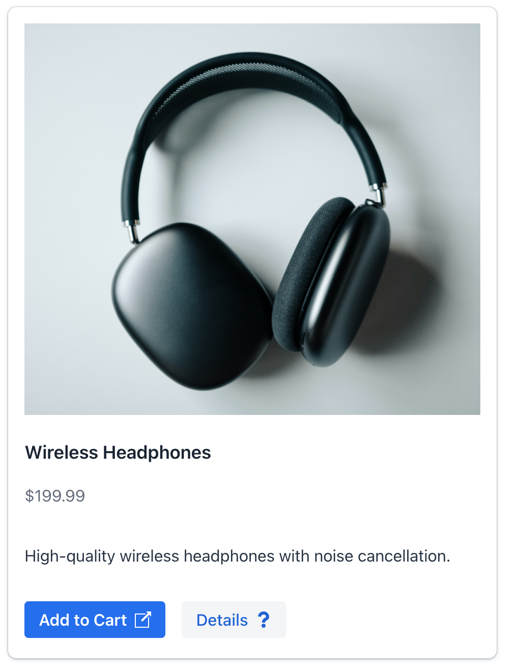
下面的示例展示如何创建一个简单的 card 用于显示产品的信息。
<card id="productCard"
      width="30em"
      themeNames="elevated"> (1)
    <title>
        <p text="msg://card.title"/> (2)
    </title>
    <subtitle>
        <p text="msg://card.subtitle"/> (3)
    </subtitle>
    <media>
        <image resource="icons/headphones.png"/> (4)
    </media>
    <content>
        <p text="msg://card.content.text"/>(5)
    </content>
    <footer> (6)
        <button id="addButton"
                text="msg://addButton.text"
                icon="EXTERNAL_LINK"
                themeNames="primary"
                iconAfterText="true"/>
        <button id="detailsButton"
                text="msg://detailsButton.text"
                icon="QUESTION"
                iconAfterText="true"/>
    </footer>
</card>| 1 | elevated 样式 使用阴影效果。 |
| 2 | 使用预定义的 title 插槽定义主标题。 |
| 3 | 使用预定义的 subtitle 插槽定义副标题。 |
| 4 | media 插槽包含产品图片。 |
| 5 | content 插槽包含主要的描述文本。 |
| 6 | footer 插槽将操作按钮组合在一起,并固定在卡片底部。 |
Card 组件以结构化的卡片式布局展示内容。卡片内的信息可以通过组件属性填充,也可以使用其内部元素(称为 slots - 插槽)填充。
卡片的视觉外观(包括阴影、边框和背景)都是可定制的。通过使用不同的 样式版本 实现。
插槽
组件提供了多个预定义的插槽,可以灵活地组织内容。插槽是组件的一个内部元素。
如需在 Jmix Studio 中添加插槽,在视图 XML 或 Jmix UI 结构面板中选择 card,然后在 Component Inspector 面板中点击 Add→[Slot Name]。
|
标题
具有预定义样式的文本内容。
可以通过以下任一方式定义卡片的标题:
-
使用组件上的
title属性。 -
使用内部的
title元素。
|
使用 title 和 subtitle 属性的卡片:
<card width="20em"
      themeNames="elevated"
      title="msg://card.title"
      subtitle="msg://card.subtitle">
    <content>
        <p text="msg://card.content.text"/>
    </content>
</card>
使用内部 title 元素的卡片:
<card width="20em"
      themeNames="elevated">
    <title>
        <div>
            <h2 text="msg://card.title"/>
            <div text="msg://card.subtitle"
                 classNames="uppercase text-xs text-secondary"/>
        </div>
    </title>
    <content>
        <p text="msg://card.content.text"/>
    </content>
</card>
副标题
副标题是带有预定义样式的次要文本内容,直接显示在标题下方。一般与标题一起使用。
可以通过以下任一方式定义卡片的副标题:
-
使用组件上的
subtitle属性。 -
使用内部的
subtitle元素。
|
使用 title 和 subtitle 属性的卡片:
<card width="20em"
      themeNames="elevated"
      title="msg://card.title"
      subtitle="msg://card.subtitle">
    <content>
        <p text="msg://card.content.text"/>
    </content>
</card>
使用内部 subtitle 元素的卡片:
<card width="20em"
      title="msg://card.title"
      themeNames="elevated">
    <subtitle>
        <div text="msg://card.subtitle"/>
    </subtitle>
    <content>
        <p text="msg://card.content.text"/>
    </content>
</card>
Header
设置一个自定义组件作为卡片的 header。
使用内部 header 元素的卡片:
<card width="20em"
      themeNames="elevated">
    <header>
        <div>
            <h2 text="msg://card.title"/>
            <div text="msg://card.subtitle"/>
        </div>
    </header>
    <content>
        <p text="msg://card.content.text"/>
    </content>
</card>
HeaderPrefix
设置一个组件用于在 header 前面显示内容。
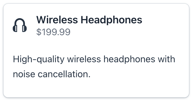
<card width="20em"
      themeNames="elevated"
      title="msg://card.title"
      subtitle="msg://card.subtitle">
    <content>
        <p text="msg://card.content.text"/>
    </content>
    <headerPrefix>
        <icon icon="vaadin:headphones"/>
    </headerPrefix>
</card>
HeaderSuffix
设置一个组件用于在 header 后面显示内容。
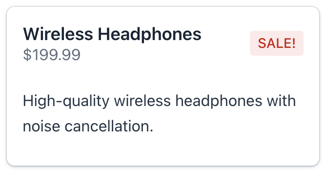
这个插槽的一般用来显示操作按钮、装饰的图标或其他与 header 相关的交互元素。
<card width="20em"
      themeNames="elevated"
      title="msg://card.title"
      subtitle="msg://card.subtitle">
    <content>
        <p text="msg://card.content.text"/>
    </content>
    <headerSuffix>
        <span text="SALE!" themeNames="badge, error"/>
    </headerSuffix>
</card>
媒体
如需控制媒体内容的尺寸,请使用 themeNames 属性设置 stretch-media 或 cover-media 样式。
<card width="20em"
      themeNames="elevated, stretch-media"
      title="msg://card.title"
      subtitle="msg://card.subtitle">
    <media>
        <image resource="icons/headphones.png"/>
    </media>
    <content>
        <p text="msg://card.content.text"/>
    </content>
</card>
内容
包含卡片的主要内容。这个插槽可以放置任意个元素,为丰富和复杂的布局提供灵活性。
<card width="20em"
      title="msg://card.title"
      subtitle="msg://card.subtitle"
      themeNames="outlined" titleHeadingLevel="4">
    <content>
        <p text="msg://card.content.text"/>
        <vbox spacing="false" padding="false">
            <p text="Color:"/>
            <radioButtonGroup id="colorRBtn"
                              themeNames="vertical"/>
        </vbox>
    </content>
</card>
Footer
定义卡片的底部区域。此插槽支持多个元素,可为操作、状态指示和补充信息提供灵活的布局。
无论主要内容的高度如何,底部始终位于卡片的底部位置。
<card width="20em"
      themeNames="elevated"
      title="msg://card.title"
      subtitle="msg://card.subtitle" titleHeadingLevel="1">
    <content>
        <p text="msg://card.content.text"/>
    </content>
    <footer>
        <span text=" Delivery: 1-2 days"
              themeNames="badge, success"/>
        <button id="buyButton"
                text="Buy Now"
                icon="vaadin:clock"
                iconAfterText="true"/>
    </footer>
</card>
样式版本
使用 themeNames 设置组件的样式。
| 样式 | 描述 | 支持的主题 |
|---|---|---|
|
为卡片添加边框 |
Aura, Lumo |
|
为卡片添加阴影效果。 |
Aura, Lumo |
|
卡片内容水平布局。 |
Aura, Lumo |
|
调整媒体内容以填满其容器。 |
Aura, Lumo |
|
裁剪媒体内容以覆盖其容器。 |
Aura, Lumo |
XML 属性
通用属性 对所有组件都是一样的配置。
下面是 card 的特殊属性:
名称 |
描述 |
默认值 |
|---|---|---|
设置具有预定义样式的次要文本内容。参阅 副标题。 |
||
设置具有预定义样式的文本内容。参阅 标题。 |
||
设置标题的 heading level 属性。用该属性的值设置 aria-level HTML 属性。 |
2 |
